I spent yesterday at a course or seminar by Edward Tufte, famous for promoting large "supergraphic" displays over the kind of overly focused walk-along-the-garden-path approach taken by many presenters, particularly when using display software such as PowerPoint. Dr. Tufte's very favorite graphic image seems to be this 1869 chart by Charles Minard, which shows the "progress" of Napoleon's 1812 advance and failed attack on Moscow, and his retreat in the dead of winter.
 This chart shows at least six variables plotted over time, for the months of the campaign. There is a rather large file behind this small reproduction; click it to see. Its story of the death of nearly 420,000 men by disease and cold makes it one of the most effective graphics ever devised.
The following, a much less rich image, nonetheless has a number of salutary design features; it is not one of Dr. Tufte's examples, but one I selected for my own analysis. It shows American home prices, adjusted for inflation and indexed to 1890.
 Dr. Tufte frequently complains of "chartjunk". There is little of that here. He promotes such a combination of words and graphic elements. Not only does it draw us along the time line, but the highlighted epochs emphasize the historical context of certain inflections. I would, however, fault this chart for its over-extrapolated dashed line on the right. Without some indication of variability, this looks too much like an "I said so" kind of prediction.
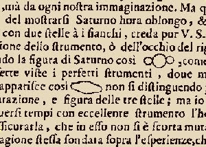
In recent years, Dr. Tufte has partly shifted his focus from large-scale graphics to those of the smallest practicable scale. He was inspired by Galileo's use of small images right in the text of his writings about his telescopic observations.
 The images of Saturn as he saw them under different atmospheric conditions are just the right size. They almost serve as words in the text. There is no need for the eyes to jump to a "Figure" at the margin and back to the text one is reading.
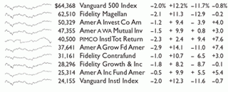
The name Dr. Tufte uses for little line graphics that fit right into the text is Sparkline. Here is an example of ten lines of a financial table with Sparklines showing the historical trend of share prices during the prior year. Rather than convey exact quantitative measures, as some graphs are intended to do, Sparklines offer a quick impression of a trend or shape with meaning of its own.
 These are remarkable for a single feature: nine of them look almost identical. Only the fifth line has a visibly different shape. This leads to further investigation, to determine that it is a different kind of fund than the others; bond rather than equity.
Sparklines have apparently already made it into the mainstream. This Yahoo Finance example shows a number of "hot" pieces of data that are updated as shares are traded. However, Dr. Tufte would deplore the boxes around the lines. They distract from the content.
 Of a half-dozen principles of data presentation, one with which I was most impressed is to take better advantage of the intelligence and initiative of the audience. They know how to read, so don't read to them. But even more so, don't try to lead them by the nose. Begin a presentation with a handout and give them time to read it. Then the "prepared slides" can serve as visual aids for answering questions. You'll just need to be prepared to hop around!
In addition to a number of good ideas, each participant came away from the conference with a set of Dr. Tufte's four principal books about the use (and misuse) of graphics. I plan to read them all right through, but don't expect reviews in this space (except perhaps an omnibus review when I finish). It would be too much like reviewing an encyclopedia.


No comments:
Post a Comment