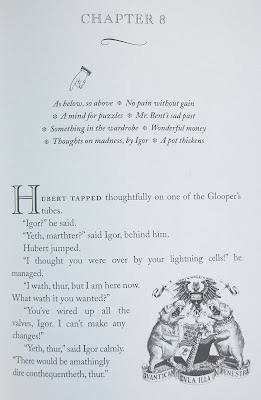
In recent years, Terry Pratchett has focused his Discworld novels on the careers of an individual or two at a time in his hyper-legendary city of Anhk-Morpork. The city's coat of arms has hippopotami rampant, its symbols are the Ankh (the loopy Egyptian cross) and the Morpork (an odd owl), and its central character is the Patrician, Lord Vetinari, as clever a rogue as ever managed a metropolis. Two prior posts of mine (
here, in an omnibus review of four books, and here) cover Pratchett offerings that focus on Commander Vimes of the Guard. I seem to have missed an earlier book that introduces Moist von Lipwig, but in Making Money we get a view of his career once he has straightened out the Ankh-Morpork Post Office.
Moist, under another name, had been hanged ... almost. Lord Vetinari had him "hanged" into a catch-basket, after which he offered him more honest employment, on terms he could hardly refuse, as they involved continuing to breathe. As Making Money opens, Moist has succeeded wildly, but is bored, and is found climbing buildings by night, to keep sharp. Vetinari has anticipated this, and contrives to lure him into the post of chairman of the city's largest bank and its mint, but with a twist: the bank is owned by a pug dog, and Moist must keep himself, and the dog, alive, long enough to resurrect the city's flaccid banking industry...in the face of a banking family that compares well (evilly?) with the Borgias.
Pratchett writes in a lovely parody of classical rhythms, and his plots loop one around until you think you're seeing the back of your head. He uses trolls (siliconic variety), golems, vampires, zombies, and other "species" as stand-ins for the ethnicities we aren't supposed to poke fun of in print. The author's fun-poking, however, far from perpetuating stereotypes, exposes and detoxifies them.
 Here, however, I wish to comment more on form than on substance. In most fiction, the visual artistry of a book, between the covers and endpapers, is confined to a "readable and balanced" typeface and perhaps dingbats to indicate longer time periods between certain sections. Where drop capitals are used, they are usually enlarged, bolded letters from the text font. In his books, Pratchett takes advantages of several tropes of 19th Century typography: each chapter's opening page contains not just a title and a paragraph or two, but also a clever graphic such as the A-M coat of arms and a humorously cryptic summary of the chapter's contents (the hand guides the unwary reader). Sections begin with a drop-letter, as used in many publications, a nod to the much earlier practice of initial-letter illumination. In this case, they are of an elegant incised hollow font also used in the chapter headings. Click on the image to see more detail.
These elements adorn a writing style that indicates a writer who is enjoying himself hugely, and intends to pass on as much enjoyment as possible to the reader. Here is a sample:
When he was a child, Moist had prayed every night before going to bed. His family were [sic] very active in the Plain Potato Church, which shunned the excesses of the Ancient and Orthodox Potato Church. Its followers were retiring, industrious, and inventive, and their strict adherence to oil lamps and homemade furniture made them stand out in the region where most people used candles and sat on sheep.Pratchett is also the apparent coiner of a lovely phrase, "War is a wicked waste of customers." This is my new favorite.
He does indeed ensure the reader's enjoyment.


No comments:
Post a Comment